Cliche Book Covers?
Posted by Meg
As Peat continues to write up a storm, the cover of the The Skull Throne is close to completion! (No, we can’t show you anything quite yet, but keep an eye on this space.)
In honor of books covers in general, check out this rather ridiculous list (yes, I am linking to Buzzfeed) of cliche book covers. The Warded Man is featured in the fantasy section along with Patrick Rothfuss and other awesome modern fantasy authors.
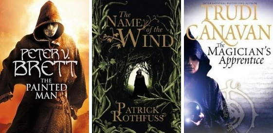
The list categorizes The Warded Man (and other books with hooded heroes standing stoically on the cover) as a fantasy book in a long, long series. Not necessarily a good or bad thing, just a trend.
How much do you pay attention to book covers? Does it influence your decision to buy a book? What do you like to see on the cover of a fantasy novel?
The cover catches my eye, the back usually makes the sale. If there’s no synopsis on the back, just back-patting snippets of how awesome the author is I put it back. I don’t care if one cover looks like another though a unique cover does tend to catch my eye first. I also, as an writer, and reader, I’m tired of the word cliche. It’s become so …well cliche to try to avoid cliches that things that were once cliche are no longer because people have avoided them for so long. The simple act of pointing out cliches is cliche to me 😉
Hah, I’m a writer and I failed at english on that middle sentence, ah well. That’s why we edit our butts off before we let people read our stuff.
Cover doesn’t effect purchases at all for me. I will typically get a book recommended from the library so I don’t see the cover until reading is already eminent. If I like it I will buy a copy.
I think it’s kind of sad how book covers look very much alike. Here is another example for the German version of the Painted Men vs. The Name of the Wind:
http://www.klett-cotta.de/media/1/9783608938159.jpg
http://ecx.images-amazon.com/images/I/71AVNo3nHSL._SL1332_.jpg
Even the font looks the same…
I also hate to say it, but the cover and translation of the German books look a lot like one of those “Twilight” clones that flooded the bookstores some time ago. “Das Lied der Dunkelheit” translates to “The song of darkness” which corresponds in no way to “The Painted Men”.
2, 3 and 5 can’t be real, can they? They’re almost exactly the same. Next to those the fantasy covers are the picture of originality.
The cover of The warded man was what made me pick up the book in the first place. (Very glad I did). I have found many great books/series that way.
The cover makes a difference.
A poor cover can stop me ever picking up a book – terrible computer rendering will almost always cost the author a sale as the impression is that the publisher obviously can’t think much of the book…
I agree with Trever – I’m sick of hearing about clichés. It is a truly bizarre world in which there exists no clichés.
Cover’s are important, it is what first attracts my eye and gets me to pick up a book and find out more, although I admit they are less important now that I tend to buy more online than in actual book shops (my out of town one closed and I tend to avoid the city centre if I can).
I am however always quite shocked when I see US fantasy covers… they always look like they are from the 80’s! I much prefer the sexy/arty UK/EU covers 🙂
I am one of those horrendous people that judges a book by its cover – to an extent. An author in my “I’m reading whatever comes out” list will be read regardless what the cover looks like. But new books – the cover plays a part, as does recommendations. Thankfully recommendations can override the cover part though. I never would have picked up Libriomancer by Jim C. Hines were it not for a glowing recommendation from Pat Rothfuss.
What do I like? I’m ok with the cliches. I think it just needs to be eye-catching in terms of placement and color. The current covers for Brent Weeks’ (I know, you’re different people – so you say) books are just awesome and feature the cloaked man.
One more thing: With a boring cover (like on Libriomancer) it’s more likely that I wil choose the cheaper eBook version instead of putting it in my bookshelf.